15 Kitchen Color Ideas That Make a Boring Space Look Expensive
Kitchen color can change the whole mood of a home faster than a major remodel. One warm wall can make breakfast feel brighter. A deep island can turn basic cabinets into a real design choice. The surprising part? You do not need new counters, custom cabinets, or a contractor who arrives at sunrise.
These 15 kitchen color ideas move from quiet neutrals to brave, joyful shades. Each one includes a realistic way to use it in a large or small kitchen, plus budget and renter-friendly options. The goal is not to chase one perfect trend. It is to find a palette that makes your kitchen feel like your home.
Quick rule: Never choose a kitchen color from a one-inch chip. Paint a large board, move it around the room, and watch it for at least two days.
From Calm Neutrals to Fearless Color: Pick Your Kitchen Mood
1. Warm White That Feels Like Sunlight

Pure white can turn chilly under cool bulbs, so choose a creamy white with a soft beige undertone. It makes a dark kitchen feel brighter without giving the room a hospital mood. Warm white is especially useful in a small kitchen because cabinets and walls visually blend, which reduces busy lines. Add oak stools, woven shades, or brass pulls so the space still has depth.
This is the color I once suggested to a friend who feared every paint swatch. We tested it beside the window for three days. By breakfast on day four, she announced that the kitchen finally looked “awake.” The easiest budget version is warm-white wall paint, usually a one-weekend project. Renters can use removable cream backsplash tiles, a washable runner, and wood accessories instead of touching cabinets.
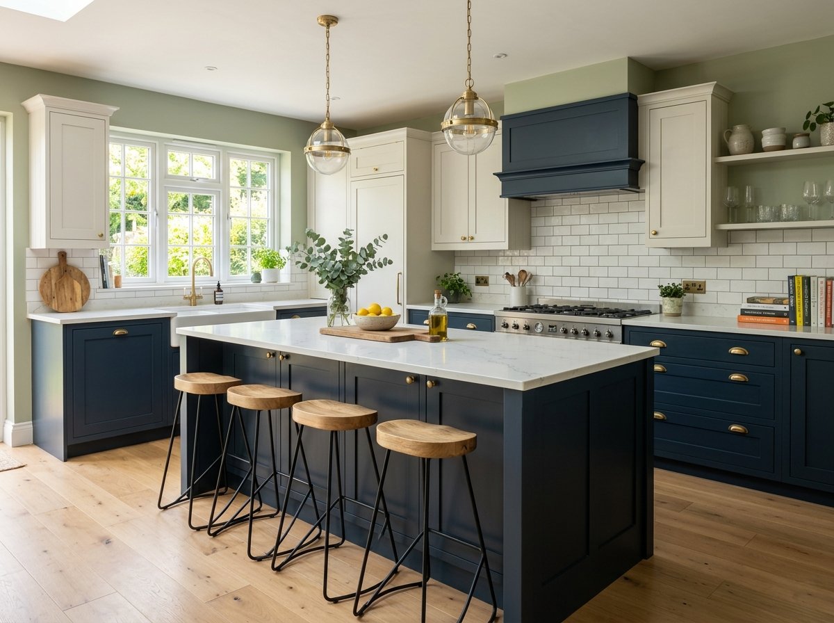
2. Sage Green for a Calm Everyday Kitchen

Sage green brings nature indoors but stays quiet enough for daily life. It works with white counters, warm wood, black fixtures, and most stainless appliances. In a narrow room, paint only the lower cabinets or the island sage and keep the uppers pale. That anchors the room without making it feel boxed in.
Before committing, tape two large sample boards beside the counter and check them in morning and evening light. Green changes more than you expect. For a lower-cost update, paint a small island or a freestanding pantry rather than every cabinet. Renters can try sage peel-and-stick paper on flat cabinet panels, but test a hidden spot first and remove it slowly.
3. Navy and White for Clean Contrast
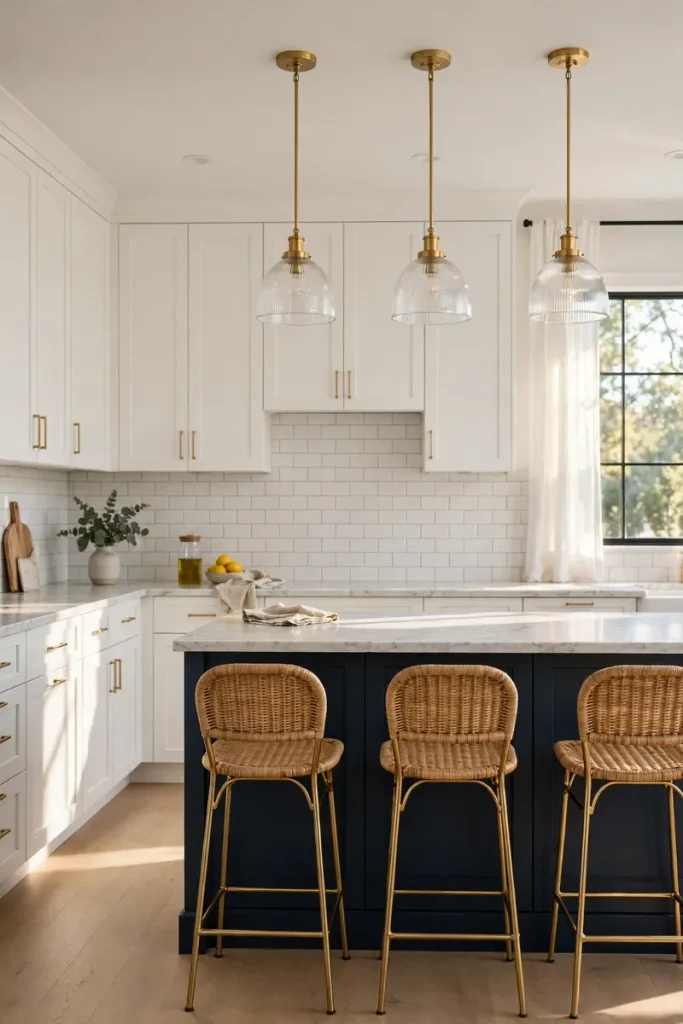
Navy lower cabinets with white uppers create a polished look that still feels friendly. The dark base hides everyday scuffs, while the light top keeps the ceiling feeling open. This pairing is a smart choice for busy family kitchens, especially when you repeat navy in just one or two small details.
Use a soft navy rather than one that reads almost black in low light. Satin cabinet paint is easier to wipe than a flat finish. If new cabinets are not in the plan, a navy runner, washable Roman shade, or painted cart gives the same color story for much less. I love this scheme because it looks dressed up even when the fruit bowl contains exactly one tired banana.
4. Charcoal and Natural Wood for Modern Warmth

Charcoal sounds dramatic, yet warm wood keeps it from feeling hard. Choose charcoal for tall cabinets or one full wall, then bring in walnut, oak, or butcher-block tones. The mix fits modern, industrial, and mid-century homes. Good task lighting matters because a dark surface absorbs more light than white.
In a small kitchen, limit charcoal to lower cabinets and let pale walls bounce light around. You can get the effect with a charcoal accent wall, wood cutting boards, and a slim wood shelf. Cabinet painting is a serious prep project: clean grease, label every door, sand or degloss, prime, and allow the finish to cure. Rushing the cure is how a “quick weekend project” becomes a month of mysterious fingerprints.
5. Butter Yellow for a Happy Morning Glow

Butter yellow is soft, sunny, and much easier to live with than a bright lemon shade. It looks lovely with cream tile, medium wood, copper, and simple black hardware. In north-facing rooms, this color can add the warmth the sun forgot to deliver.
Use yellow on a breakfast nook, lower cabinets, or a small pantry door if a full room feels bold. Keep counters and large patterns quiet so the color remains cheerful, not loud. Renters can bring it in through cafe curtains, canisters, art, and a washable rug. Start with one item and repeat the yellow twice; that makes it look planned. Otherwise, your new toaster may seem to have wandered in from another kitchen.
6. Terracotta Walls for Earthy Character

Terracotta wraps a kitchen in earthy warmth. The color sits between orange, clay, and rust, so it pairs naturally with olive green, cream, dark wood, and aged brass. It is an excellent way to make a plain builder kitchen feel collected rather than brand-new and blank.
Because terracotta is strong, begin with one wall or a small dining corner. A matte wall finish looks rich, but use a washable paint where splashes happen. In a tiny kitchen, balance it with a pale ceiling and light backsplash. If painting is not allowed, try clay-colored linen curtains, framed art, planters, or removable wallpaper away from the stove and sink. Sample first; under very warm bulbs, some clay colors can suddenly shout “pumpkin soup.”
7. Dusty Blue for an Easy, Timeless Update

Dusty blue has enough gray to feel grown-up and enough color to keep the kitchen interesting. It works with marble-look counters, white tile, brushed nickel, and honey-toned floors. Unlike a trendy electric blue, this shade is gentle enough to cover many cabinets without taking over the house.
For a small room, use a medium dusty blue below counter level and keep the backsplash simple. Match the wall undertone to the cabinets: cooler whites feel crisp, while warm whites soften the look. A thrifted hutch painted dusty blue can become storage and a focal point at once. If you are renting, blue seat cushions and a vintage-style rug deliver the mood with no deposit-threatening drama.
8. Black and Cream for Soft Drama
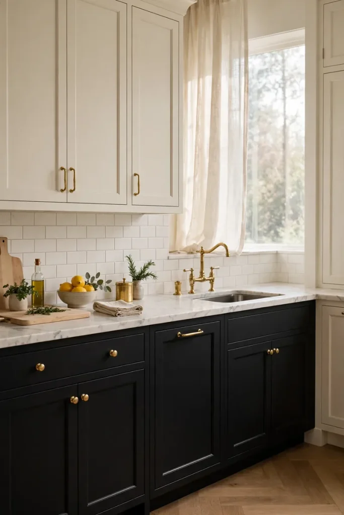
Black cabinets can look elegant rather than harsh when cream replaces stark white. Add a wood shelf or beam, warm metal hardware, and layered lighting. This palette is especially useful in an open kitchen because it gives the cooking area a clear visual frame.
Do not let black cover every surface in a windowless room. Keep the ceiling, backsplash, and at least one wall light. In compact kitchens, try black on the island or just the lower cabinets. A renter can use a black cart, cream rug, and matte black pulls, saving the original hardware in a labeled bag. That last step is boring but heroic when move-out day arrives.
9. Mushroom Taupe for Quiet Luxury

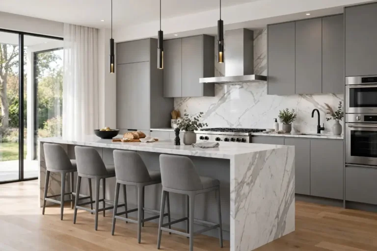
Mushroom taupe is the comfortable middle ground between gray and beige. It feels calm, hides light dust better than bright white, and supports both warm and cool accents. Pair it with creamy walls, veined stone, aged brass, or dark bronze for a layered look.
This neutral is sensitive to nearby flooring. A taupe that looks perfect in the store may turn pink beside red oak or green beside cool tile. Paint a movable sample board and hold it near the floor, counter, and backsplash before buying gallons. On a smaller budget, repaint a pantry cabinet or add taupe Roman shades and pottery. The result is subtle, which is design language for “your aunt cannot immediately guess what changed, but she likes it.”
10. Soft Pink That Still Feels Sophisticated

A dusty blush can be surprisingly refined in a kitchen. Choose a muted shade with beige or gray underneath, then ground it with white, burgundy, walnut, or dark hardware. Pink works beautifully on a single cabinet run, a pantry, or an island, so you do not need to turn the whole room into a candy shop.
In a small kitchen, keep patterns simple and let the pink be the star. Paint a large sample because tiny chips often look sweeter than the final wall. Renters can use blush cafe curtains, framed prints, a runner, or peel-and-stick paper on the back of open shelves. If the space starts feeling too cute, one black lamp or dark wood board usually restores balance.
11. Forest Green for a Rich, Collected Look

Forest green feels classic, grounded, and a little dramatic. It is beautiful with off-white tile, soapstone-look counters, medium wood, and unlacquered brass. Rooms with generous windows can handle it on many cabinets; darker kitchens should use it more carefully.
Keep upper walls pale and add under-cabinet lights so prep areas remain useful. In a galley kitchen, green lowers on both sides can create a cozy path without shrinking the room as much as dark uppers would. For a less expensive change, paint the back door or a freestanding cabinet. A deep green runner and herbs in clay pots can give renters the same woodland feeling—without inviting an actual raccoon to dinner.
12. White and Wood for an Airy Two-Tone Plan

White and natural wood is an easy two-tone formula for people who want warmth without a bold cabinet color. White keeps the room open; wood adds texture and prevents a flat look. Repeat the wood tone in two or three places, such as stools, shelves, and picture frames.
For small kitchens, a white wall of cabinets with a wood island or cart creates contrast without visual clutter. If real wood cabinetry is outside the budget, use a butcher-block-style counter on one small section or install a simple wood shelf. Renters can bring in an unfinished wood cart and seal it properly. Do not place an unsealed top beside the sink unless you enjoy collecting water rings as tiny abstract art.
13. Coastal Blue Without the Beach Theme
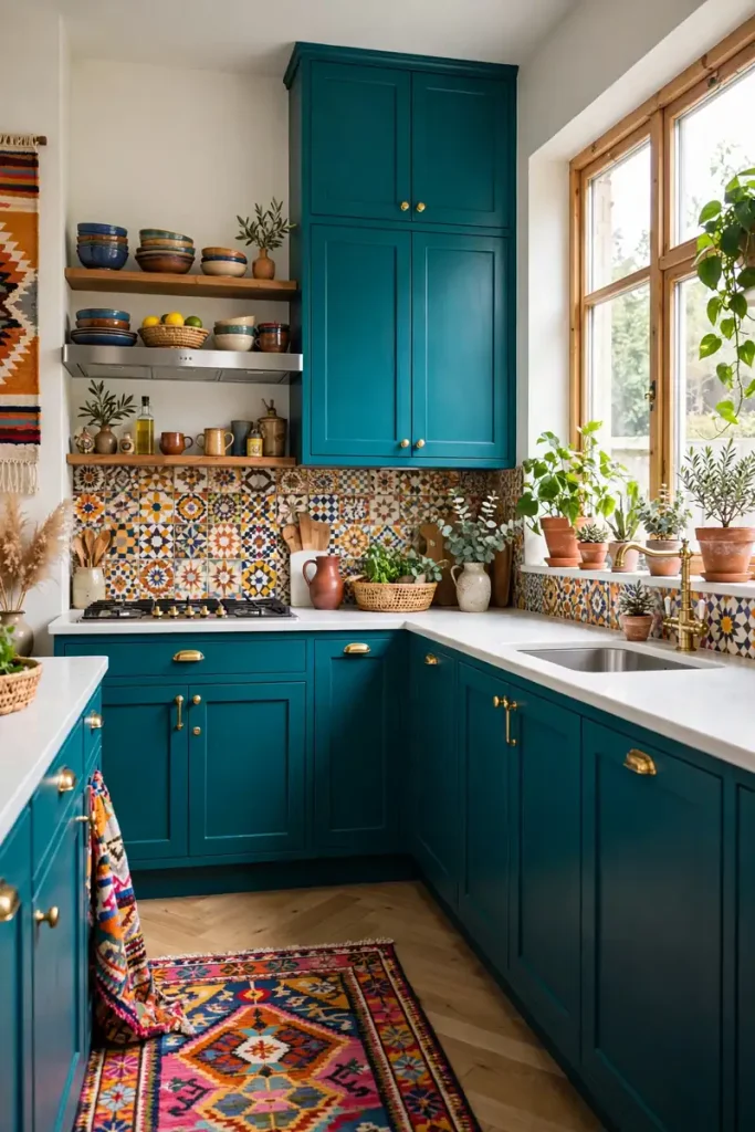
Coastal blue can feel fresh even when the nearest ocean is several states away. The trick is to use clean lines and restrained accessories instead of filling the room with anchors and signs. Pair a clear medium blue with white cabinets, pale wood, woven texture, and simple chrome or nickel.
Paint only the island to create a focal point and make an all-white kitchen less plain. In a small room, one blue base cabinet or cart is enough. Removable blue backsplash tiles, stools, and striped towels are renter-friendly alternatives. Keep the shade consistent across a few pieces; five unrelated blues can make the kitchen look like a paint store lost an argument.
14. Moody Plum for a One-of-a-Kind Kitchen

Deep plum sits between red and purple, giving a kitchen warmth and personality. It is bold, but it can read almost neutral when paired with creamy stone, walnut, or aged brass. Use it on an island, lower cabinets, or a compact beverage station for a controlled dose.
Plum needs a real-life test. View the sample beside your floor and under every bulb because some shades swing bright purple at night. Choose a durable satin or semi-gloss finish for cabinets. If commitment makes you nervous, paint a small hutch or use burgundy stools and textiles. This is the color for anyone who wants guests to say, “Wait, what shade is that?” in the best possible way.
15. A Colorful Island for Low-Risk Energy

If you love color but fear repainting thirty cabinet doors, focus on the island. Blue, coral, green, or golden yellow can wake up a neutral kitchen while the surrounding cabinets stay easy to live with. It is also simpler to change later if your favorite color evolves.
Pull the accent shade from a nearby room so the open floor plan feels connected. Then repeat it once in art or a small appliance, not everywhere. A small kitchen without an island can use a painted cart, colorful stools, or removable vinyl on a table base. This approach is friendly to renters and cautious decorators alike. Think of the island as a bright handbag: it finishes the outfit, but it does not need to match the socks.
A Simple Color Plan Before You Buy Anything
First, collect the fixed colors you cannot easily change: flooring, counters, backsplash, and appliances. Put paint samples beside all of them. Check the samples in daylight, on a cloudy afternoon, and at night. A color that behaves beautifully at 10 a.m. can become a completely different person after dinner.
Next, use a simple 60-30-10 idea: let one quiet color cover most of the room, a second color support it, and a smaller accent add personality. You do not have to measure it perfectly. The point is to avoid asking every surface to be the star.
For cabinets, expect more time and prep than a wall. Current national guidance from Angi says DIY cabinet-painting supplies often run about $200 to $600, and the work can take 20 to 40 hours or more. Professional pricing and local labor vary widely, so get several local quotes before planning the budget. A wall, island, cart, or removable accent can deliver a major color change for far less.
Final Thoughts
The best kitchen color is not simply the shade receiving the most pins this month. It is the one that works with your light, your fixed finishes, and the amount of cleaning you actually want to do. Warm white and mushroom taupe are gentle starting points. Sage and dusty blue bring calm. Plum, terracotta, and a colorful island bring the fun.
Start with samples, make one change, and live with it for a few days. Your kitchen does not need to become perfect overnight. It only needs to feel a little more like you—and maybe make that first cup of coffee look unusually photogenic.