13 Fall Ombre Nails, Captured Like Frames From a Sunset Time-Lapse
I once spent forty minutes on a beach trying to photograph a sunset, convinced I needed to wait for one perfect, singular moment. What I actually got, scrolling back through the shots afterward, was a sequence, dozens of frames, each one a slightly different gradient of the same sky, none of them identical, all of them beautiful in a different way. Ombre nails work the same way. There isn’t one correct blend. There’s a whole sequence of transitions, each one capturing a different moment of color shifting into another.
So I built this post as that time-lapse. Thirteen frames, each one an ombre design captured at a specific moment of an imagined sunset, from the bright gold of late afternoon through to the deep indigo just before full dark. Every frame includes a timestamp, an exposure note on the actual blending technique, and a duration rating for how long the realistic wear holds up. Extras on the technical side of blending follow the sequence.
The Sequence
Frame 1, 4:15 PM, Bright Gold.
The sky at its brightest before any real color shift begins.
Transition: a soft blend from sheer champagne at the cuticle into a warm honey-gold at the tip.
Exposure note: apply the lighter shade first as a full base, then sponge the gold on only at the tip in one light pass, since this frame’s subtlety depends on a genuinely gentle transition rather than a dramatic one.
Duration: good, ten to twelve days, since the pale base shows minor wear slowly.
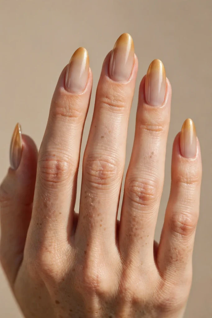
Frame 2, 4:45 PM, Amber Haze.
The light thickens, gold deepening into amber.
Transition: a blend from warm honey at the cuticle into a richer amber-orange at the tip.
Exposure note: use two sponge passes at the tip rather than one, building the amber gradually so the transition zone in the middle of the nail reads as a genuine gradient rather than two distinct blocks of color.
Duration: good, ten days.
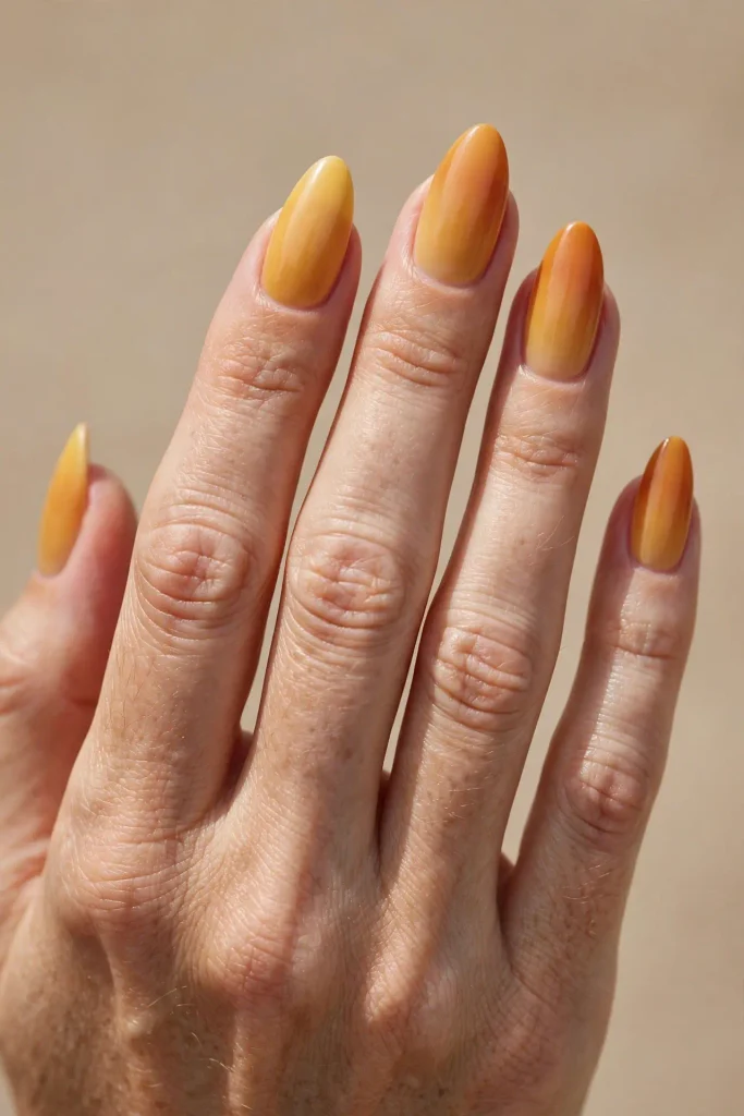
Frame 3, 5:00 PM, Burnt Copper.
The sun drops lower, color intensifying toward orange-red.
Transition: a blend from amber at the cuticle into a deep burnt-orange, almost copper, at the tip.
Exposure note: this frame benefits from a very slightly damp sponge rather than a fully dry one, which helps the copper tone diffuse more smoothly into the amber beneath it rather than sitting as a harsh, separate layer.
Duration: good, ten days.
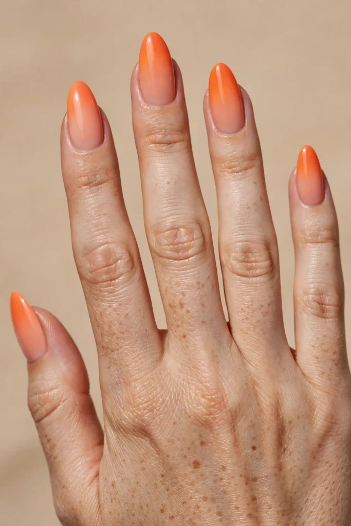
Frame 4, 5:15 PM, Clementine Fade.
A brighter, more citrus-forward moment before the deeper tones take over.
Transition: a blend from a soft peach at the cuticle into a vivid clementine-orange at the tip.
Exposure note: this is the most saturated, boldest frame in the early sequence, and it benefits from working quickly, since brighter, more opaque colors set faster on the sponge and can look patchy if you take too long blending them in.
Duration: fair, seven to nine days, since brighter pigments show wear sooner than the deeper frames later in the sequence.
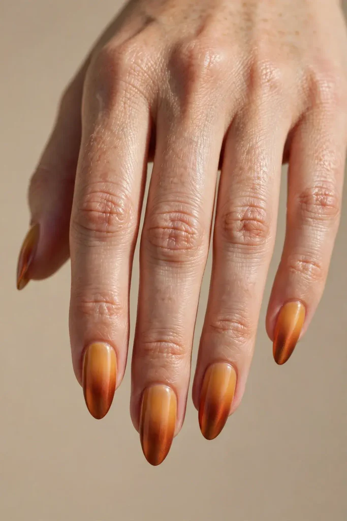
Frame 5, 5:30 PM, Rust Horizon.
The horizon line itself, warm rust meeting the first hint of something cooler above it.
Transition: a blend from burnt orange at the cuticle fading into a muted, dusty rust-brown at the tip.
Exposure note: this frame is the first to genuinely benefit from a three-color blend rather than two, adding a thin transition layer of plain brown between the orange and rust to soften what would otherwise be too abrupt a shift.
Duration: excellent, twelve days, since the deeper, more muted tones at the tip camouflage wear especially well.
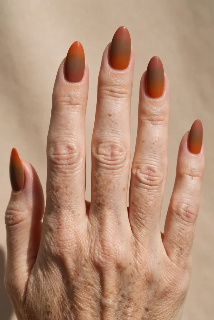
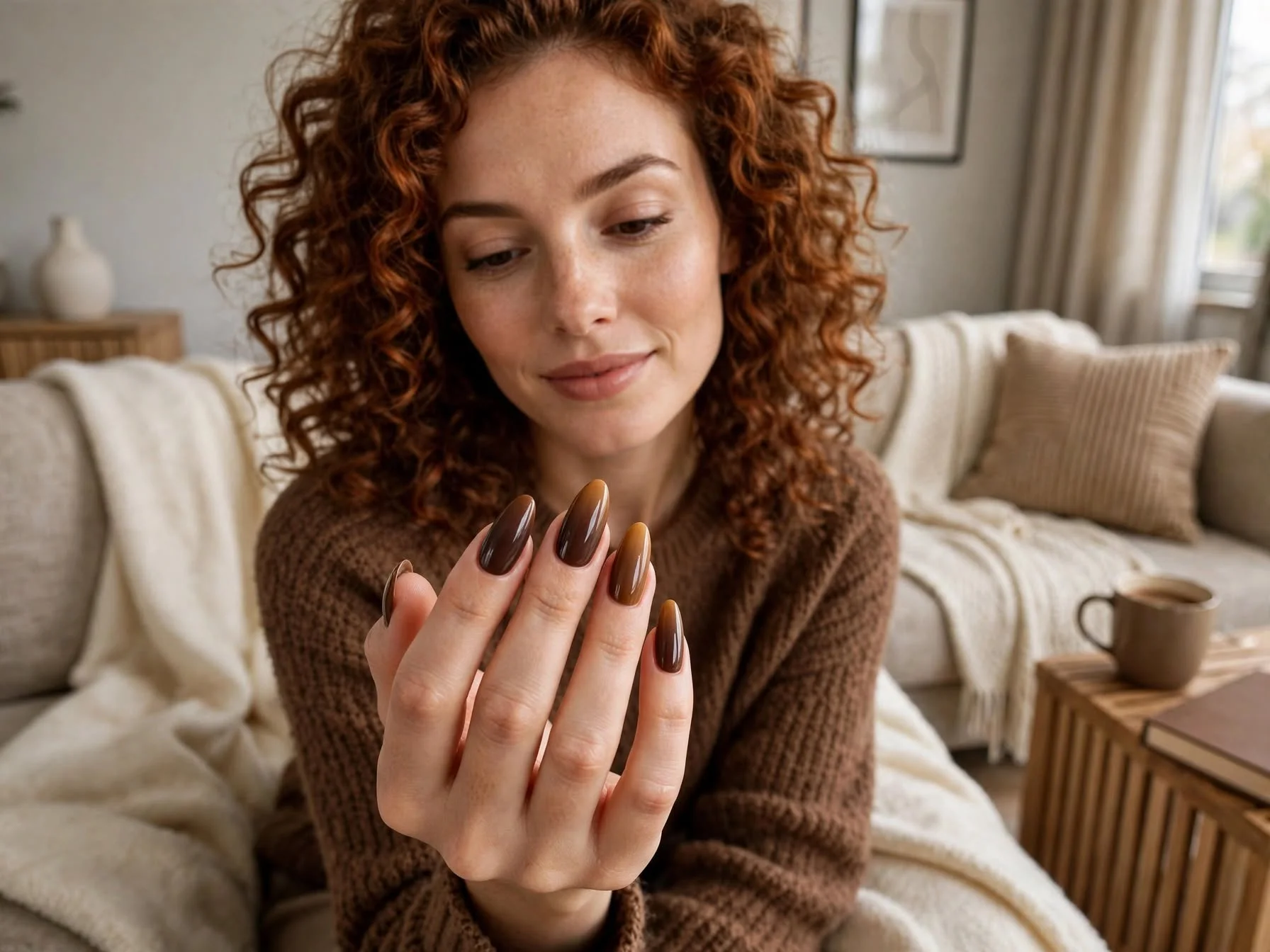
Frame 6, 5:45 PM, Cinnamon Dusk.
Warmth beginning to give way to shadow.
Transition: a blend from rust-brown at the cuticle into a deep cinnamon-espresso at the tip.
Exposure note: work the darker espresso tone in with slightly firmer sponge pressure than the earlier, lighter frames required, since deeper pigments need more physical pressure to diffuse evenly rather than sitting as a solid block.
Duration: excellent, twelve to fourteen days.
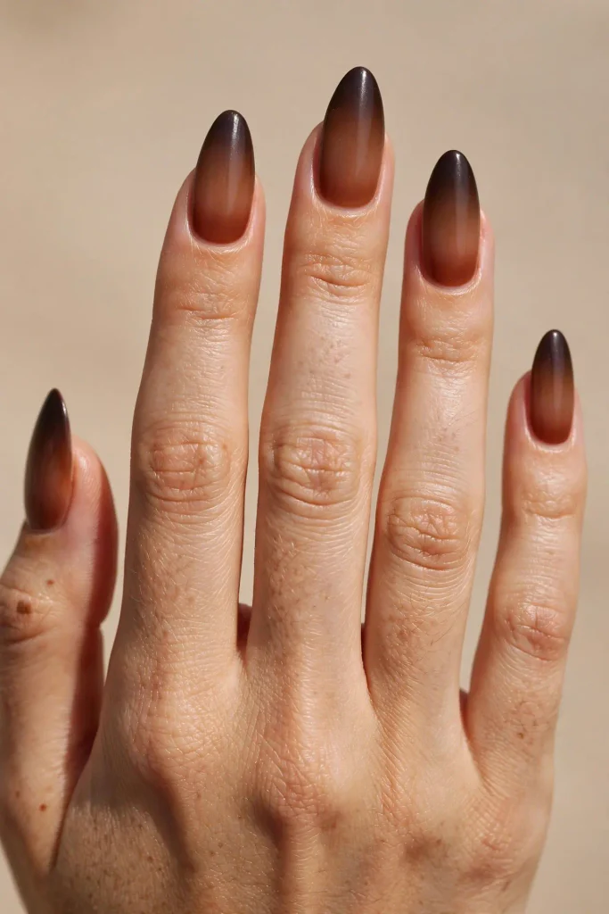
Frame 7, 6:00 PM, Wine Twilight.
The moment orange fully gives way to something moodier.
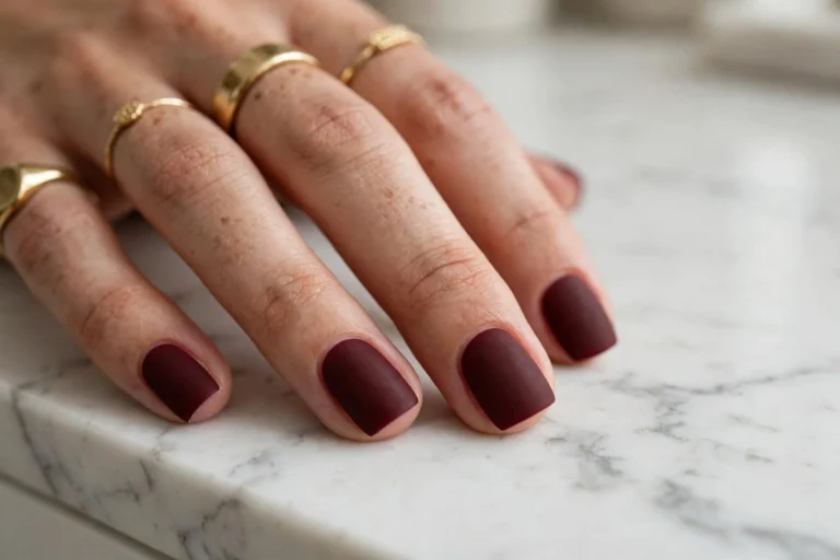
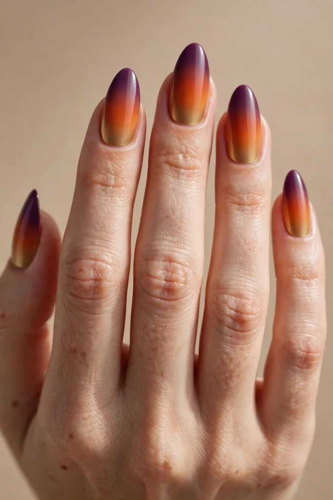
Transition: a blend from burnt orange at the cuticle into a deep burgundy-wine at the tip, the most dramatic color shift in the whole sequence.
Exposure note: because this frame spans the widest color distance, orange to wine, use a genuine three-stage sponge process, orange, then a brief transitional maroon, then full burgundy, rather than attempting to blend two very different hues directly into each other.
Duration: good, ten to eleven days.
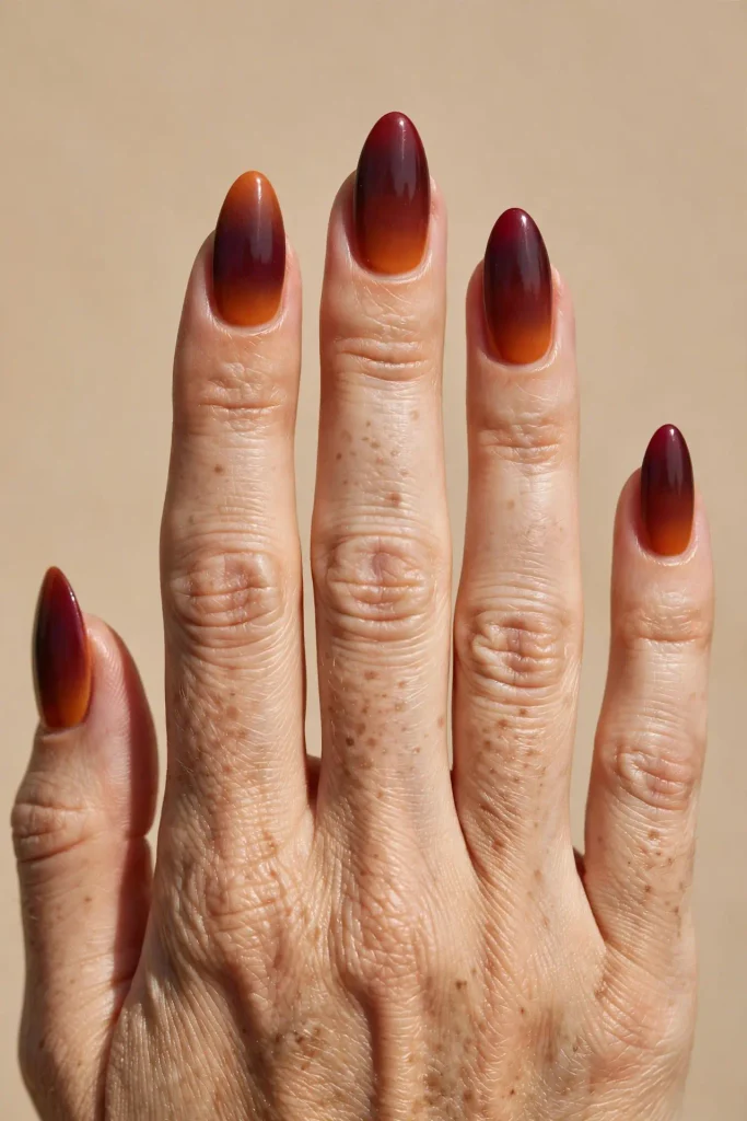
Frame 8, 6:15 PM, Plum Shadow.
Color deepening further, the last visible warmth fading.
Transition: a blend from burgundy at the cuticle into a deep plum-purple at the tip.
Exposure note: this frame benefits from a slightly glossy top coat rather than matte, since the shine helps the plum tone catch what little light remains in the composition and keeps the whole thing from reading as flat.
Duration: excellent, twelve days.
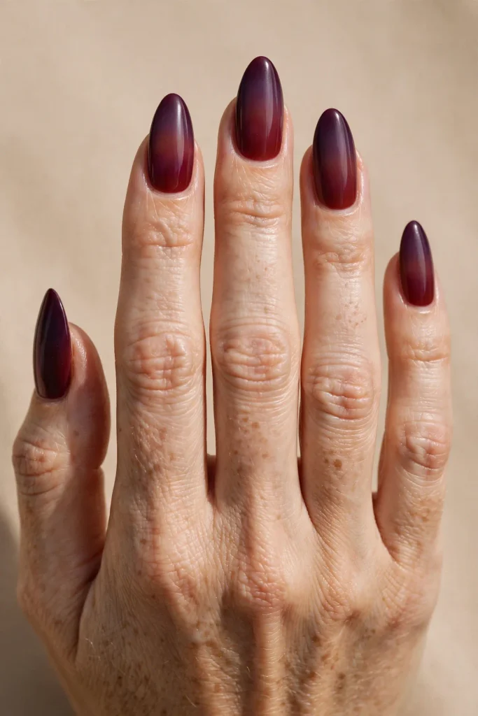
Frame 9, 6:30 PM, Deep Violet.
Nearly full dusk, the sky reading as almost entirely cool now.
Transition: a blend from plum at the cuticle into a deep violet-indigo at the tip.
Exposure note: work in a cooler-lit space if possible while applying this frame specifically, since warm indoor lighting can trick your eye into thinking the violet reads more blue or more purple than it actually will look once you check it in daylight.
Duration: good, ten to eleven days.
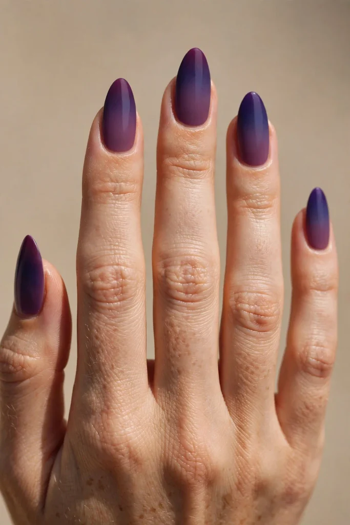
Frame 10, 6:45 PM, Indigo Fade.
The last frame with any visible color distinction before true dark.
Transition: a blend from violet at the cuticle into a deep, near-black indigo at the tip.
Exposure note: the transition zone here is genuinely subtle, both colors sit close together in depth, so take extra time blending the middle of the nail specifically, since a rushed blend at this stage tends to leave a visible hard line rather than the soft fade the rest of the sequence has built toward.
Duration: excellent, twelve to fourteen days.
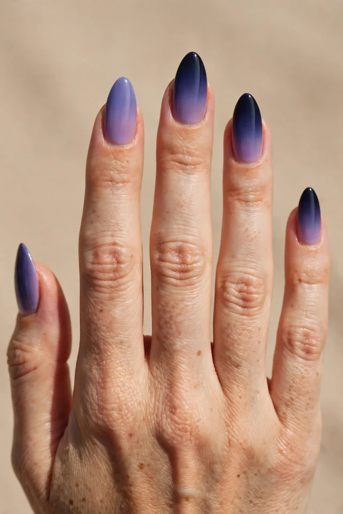
Frame 11, 7:00 PM, First Stars.
Full dark beginning to settle, with one small, deliberate point of brightness.
Transition: a solid, deep charcoal-black base with a single, small cluster of fine gold shimmer applied only at the very tip of each nail, breaking from the smooth gradient format of the earlier frames into something more textural.
Exposure note: apply the gold shimmer with a very light touch and only at the extreme tip, resisting the urge to blend it further up the nail, since the whole effect depends on it reading as a small, isolated point of light rather than another gradient layer.
Duration: good, ten days, since fine shimmer at the tip is a genuinely high-wear zone.
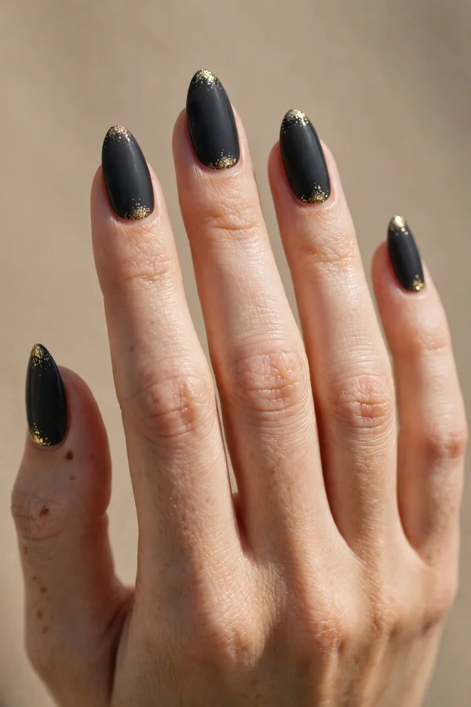
Frame 12, Reverse Frame, Dawn Instead of Dusk.
A deliberate break in the time-lapse, capturing the opposite direction, dark giving way to light rather than light fading to dark.
Transition: a blend starting with deep espresso-black at the cuticle and fading upward into a warm, pale gold at the tip, the exact reverse order of Frame 1.
Exposure note: reversing the direction of a gradient changes how it reads on the hand entirely, drawing the eye toward the tip rather than the cuticle, and this frame is worth trying specifically if you’ve only ever blended gradients in the traditional light-to-dark direction.
Duration: good, ten to eleven days.
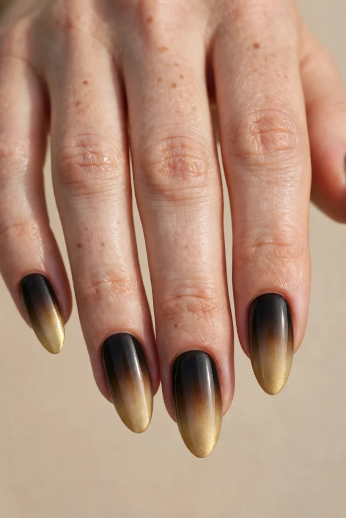
Frame 13, Long Exposure, The Full Sky Captured at Once.
A single frame attempting to hold the entire sequence within one nail rather than choosing just one moment.
Transition: a genuine three-color blend spanning gold at the cuticle, through burnt orange in the middle third, into deep plum at the tip, essentially compressing Frames 1 through 8 into a single nail.
Exposure note: this is the most technically demanding frame in the whole sequence and benefits enormously from working in thirds rather than trying to blend all three colors in one continuous motion, sponge and blend the gold-to-orange transition first, let it set slightly, then sponge and blend the orange-to-plum transition second, treating it as two separate gradients stacked rather than one continuous three-color fade.
Duration: good, ten days, provided the multiple transition zones are each given proper time to set before moving to the next.
Something New: The Blending Tool Comparison
Different tools genuinely produce different quality gradients, and understanding which suits which frame in the sequence above saves considerable frustration.
A makeup sponge, cut into a small triangular point for more control, is the standard tool used throughout this sequence, producing a soft, slightly textured gradient with visible but gentle blending. It’s the most forgiving option for beginners and suits nearly every frame above. A silicone gradient sponge, a specialty tool with a finer, more uniform texture than a standard cosmetic sponge, produces a noticeably smoother, more seamless blend with less visible texture, better suited to the subtler transitions in Frames 9 and 10 where a harsh line is the biggest risk. An airbrush system, genuinely professional-level equipment, produces the smoothest possible gradient with essentially zero visible texture or hard edges, ideal for Frame 13’s ambitious three-color blend but requiring equipment most people don’t own at home. A dry brush technique, dragging a slightly dry, stiff brush through two wet colors rather than dabbing with a sponge, produces a streakier, more organic gradient, an interesting alternative specifically worth trying on Frame 5’s rust horizon or Frame 6’s cinnamon dusk, where a slightly more textured, less perfectly smooth blend actually suits the earthy color story better than a flawless airbrush finish would.
The Direction Guide
Every frame in the sequence above blends vertically, cuticle to tip, which is the traditional and most common ombre direction, but it’s worth understanding the alternatives before committing.
Vertical gradients, cuticle to tip as in Frames 1 through 11, tend to visually lengthen the nail and are the most universally flattering direction regardless of nail shape or length. Horizontal gradients, blending side to side across the nail’s width rather than top to bottom, are less common but genuinely striking on wider nail shapes, worth trying as a variation on Frame 4’s clementine fade specifically, since the bright, bold color reads even more dramatically running horizontally. Diagonal gradients, blending at an angle rather than a straight vertical or horizontal line, add a sense of movement and are particularly effective on the darker, moodier frames toward the end of the sequence, Frame 8 or Frame 9, where a diagonal blend can suggest something closer to actual clouds or fading light rather than a flat, static transition.
Color Transition Science
Gradients that feel genuinely natural, rather than looking like two colors simply pasted next to each other, rely on the two chosen shades sitting reasonably close together on the color wheel, exactly the way this whole sequence was built to move gradually through adjacent hues, gold into orange into rust into wine into plum into violet, rather than jumping between unrelated colors.
When two colors sit far apart on the color wheel, as in Frame 7’s ambitious orange-to-wine transition, the blend needs a genuine transitional step, using a color that sits between the two on the wheel, rather than attempting to fade them directly into each other. This is exactly why Frame 7’s exposure note specifically calls for a brief maroon transition stage rather than blending orange straight into burgundy, and it’s the single most useful principle to borrow if you want to design your own gradient outside this sequence entirely: choose two colors, then ask whether a third, in-between shade needs to bridge them, rather than assuming any two colors will blend smoothly just because they’re both being sponged onto the same nail.
Streaking Troubleshooting
Streaking, meaning visible lines or uneven patches rather than a smooth gradient, is the single most common issue across every frame in this sequence, and it traces back to one of a small handful of causes almost every time.
If the gradient shows a hard, visible line rather than a soft fade, the sponge was likely pressed too firmly in one spot rather than dabbed lightly in overlapping, feathered motions across the transition zone. If the colors look muddy rather than layered, too much wet polish was loaded onto the sponge at once, worth dabbing the loaded sponge onto a paper towel first to remove excess before pressing it onto the nail, a step nearly every frame above depends on. If the gradient looks patchy with visible gaps of bare nail showing through, the base coat likely wasn’t given a full, even layer before the gradient work began, gradients need a genuinely solid, opaque foundation to blend on top of rather than working directly on bare or unevenly covered nail. If one nail’s gradient looks noticeably different from its neighbors despite using the identical two colors, the sponge was likely reloaded with wildly different amounts of polish between nails rather than kept consistent, worth reloading the sponge the same way, dab, blot excess, press, for every single nail in the set to maintain a uniform look across the whole hand.
The Camera-Ready Application Tip
Because ombre nails, more than almost any other design, are genuinely built to be photographed the way a real sunset time-lapse is, a small application detail makes a noticeable difference in how they read in photos afterward. Apply the final glossy top coat in a single, confident stroke running the full length of the nail from cuticle to tip, rather than multiple overlapping strokes, since multiple strokes over a gradient specifically tend to create tiny streaks in the top coat that become far more visible in photographs than they are to the naked eye in person, catching and slightly distorting light across the transition zone in a way a single clean stroke avoids entirely.
Choosing Your Frame by Season Progress
If it’s early fall and you want something bright and welcoming, Frames 1 through 4, the golds and ambers, capture that opening-afternoon-light quality perfectly. If you’re deep into peak fall color, Frames 5 through 8, the rusts, cinnamons, and wines, mirror the season at its most saturated. If you’re heading toward the colder, darker end of the season, Frames 9 through 11, the violets and indigo, carry that same late-dusk mood. And if you genuinely can’t choose a single moment, Frame 13’s ambitious full-sequence blend, while the most technically demanding, captures the entire seasonal arc in one design.
Quick Answers
What’s the easiest ombre frame for a genuine beginner?
Frame 1 or Frame 2, since both involve two closely related, adjacent colors and a gentle, forgiving transition rather than the more dramatic, wider color-wheel jumps found later in the sequence.
Why do some gradients look smooth and others look streaky using the identical two colors?
Almost always sponge technique and loading, dabbing lightly in overlapping motions with excess polish removed first, rather than pressing firmly with a fully loaded sponge, is the difference between a smooth blend and a streaky one.
Can I blend more than two colors in one gradient?
Yes, as shown in Frame 13, though it requires working in stages, treating each color transition as its own smaller gradient built in sequence, rather than attempting to blend three colors simultaneously in one continuous motion.
Does the direction of the gradient actually matter, or is vertical always correct?
Vertical is the most universally flattering and common direction, but horizontal and diagonal gradients, covered in the Direction Guide above, offer genuinely different visual effects worth trying on specific frames, particularly the bolder, more saturated ones.
One Last Thing
Ombre nails were never really about capturing one single perfect blend, the same way a real sunset was never about waiting for one perfect, singular photograph. It’s a sequence, one moment shifting gradually into the next, and the most successful gradients are the ones that respect how close together their colors actually sit before asking them to blend.
Start with a frame from the early, gentler part of the sequence if gradients are new territory for you, work toward the more ambitious multi-color frames as your sponge technique develops, and don’t be afraid to run the sequence in reverse, dawn instead of dusk, once you’ve got the basic technique down.
Which frame are you capturing first: the bright gold of early afternoon, or the deep indigo just before full dark? Save this article for your next manicure appointment, and send it to a friend who always says her gradients come out streaky no matter how many times she tries.